Using
- Download
 bar_chart.zip (4 KB).
 - Install the script.
- In OmniGraffle open a new document and select
 > Bar chart.
 - In the window that appears enter the appropriate data, separated by spaces. It doesn't have to be whole numbers, but it will freak out if you put in negatives.
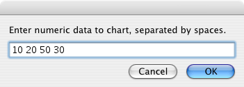
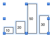 Hit OK... tada!
Tips and other uses
What you have now is pretty neat, but can easily be made to look a lot better.
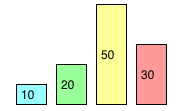 Change the fill colour of the bars.
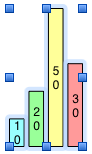
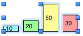 Scale the chart. Select all the bars, then drag the blue control points around. Holding down shift while doing this preserves the aspect ratio, but the relative height of the bars remains correct even if you don't do this.
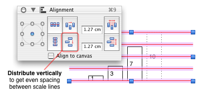 If you are trying to add scale lines to your graph, it may be helpful to add some extra columns to your chart to line them up more easily. The example on the left shows graphing the data 1, 3 and 7. The extra 10 (shown with dotted outline) is added, and lines aligned by hand (using the up and down arrows for fine adjustments) with the top of this, and the bottom of the bars.
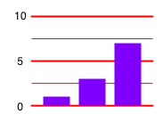 Another three identical lines are added, then distributed evenly, giving a line every 2.5. The bar for 10 can then be deleted. Important scale lines could possibly be made thicker than the others, as shown here. These lines have also been Sent to back so that they appear under the bars. Pleasingly, the graph can still be resized with ease; as long as you select everything, it all stays in proportion.
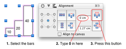 Setting the spacing between the bars to zero produces what is technically a histogram. This is the one to use if you have continuous data like "Hours spent sleeping" with groupings like 0–12, 12–24, etc., whereas with things like "Favourite cheese", where the groupings are discrete, the spaced bar chart is the correct thing.
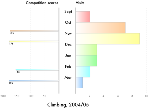
Maybe add some gradient fills, stack two graphs back-to-back, add more labels and some scale lines, and you can end up with something quite fancy, quite quickly!